Today we will be sharing the creative process behind our brand new AW15 collection. Betty, our company director and chief designer, is going to talk us through what inspired both the Agatha and Lennox collections. Over to you Betty:
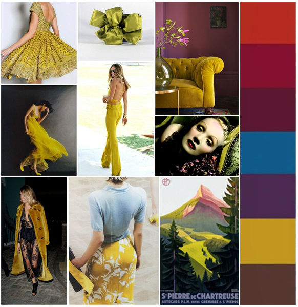
“With most collections I like to start with a pinterest board. It’s a really great way to get down quickly all the hottest trends and themes for a particular season. One colour trend that really spoke to me this season was chartreuse. It’s one of those colours that people instantly love or hate. Well I am definitely on the side of love! In my research I think the following quote sums up best the colour
“A colour halfway between yellow and green that was named because
of its resemblance to the green colour of one of the French liqueurs
called green chartreuse, introduced in 1764” – Wikipedia
If it’s good enough for the French, then it’s good enough for me! Here are a selection of some of the images that really spoke to me.
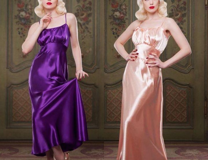
What really spoke to me about this colour was how rich and luxurious it is. A perfect embodiment of 1930’s decadence and almost has an exoticism to it. When thinking about fabrics and shapes for AW15, I wanted to get across the contrast of the chartreuse with another darker colour which resulted in the use of a beautiful stretch silk satin in chartreuse with a sheer dotted tulle in black. Layering the two together really helped communicate the dark exotic feeling I was trying to evoke. The result was the Agatha Robe and Agatha Nightgown.
Our location for the AW15 shoot was a gem of a find. When I saw the library/billiards room, I knew it was a perfect location.
It perfectly sums up the extravagance of the 1930s. It reminded me of an episode of Poirot – a grand stately home setting with a hint of thrilling mystery. The location gave us a huge amount of variety to shoot with. Room upon room of grandeur and splendour at Althelhampton House in Dorset, UK.
For our second collection for AW15, another trend that really spoke to me was luxury travel. The 1930’s were a era synonymous with luxury travel. You only have to look to the luxury cruise liners of the era and the Orient Express. Those bastions of Art Deco design. I was keen to produce our own exclusive print to use in our lounging garments so collaborated with textiles designer Christie Goule. The board below really inspired me in terms of colour trends for AW15 and different repeating Art Deco prints.
The strong seeping lines of a repeat print featured heavily in the Art Deco period and really helped me to think about the shaping included in our Lennox pyjama top. The colour ‘celadon’ was also huge in the 1930’s so helped with picking a colour pallette that was due to feature heavily in the catwalks of AW15. Christie, did a really great at translating the feel and look I was trying to create, updating it into a contemporary luxe print perfect for a modern woman.
The location to shoot the Lennox set really helps to show off this luxury pyjama set to perfection. Rich gold and copper tones so evocative of the rich Art Deco era, perfectly contrasted to cool tones of the colour ‘celadon’ inspired print.
You can see our full pinterest board by clicking the picture below.
Follow Betty Blue’s ‘s board AW15 Photoshoot Inspiration on Pinterest.
Lots of Love
Betty and all at Team Blue’s xxx


Leave a reply